text, number, email, url, search, password, secret
Single-line input. Seven components share one view, lte3::components.text, and differ only in the default type (and a few defaults) from the config.
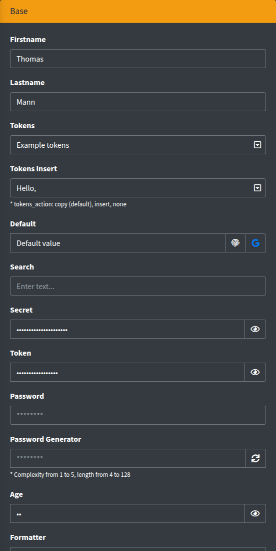
Signature
Section titled “Signature”Lte3::text(string $name, mixed $value = null, array $attrs = [])Lte3::number(string $name, mixed $value = null, array $attrs = [])Lte3::email(string $name, mixed $value = null, array $attrs = [])Lte3::url(string $name, mixed $value = null, array $attrs = [])Lte3::search(string $name, mixed $value = null, array $attrs = [])Lte3::password(string $name, mixed $value = null, array $attrs = [])Lte3::secret(string $name, mixed $value = null, array $attrs = [])| Component | Config default |
|---|---|
text | ['type' => 'text'] |
number | ['type' => 'number', 'default' => 0] |
email | ['type' => 'email'] |
url | ['type' => 'url'] |
search | ['type' => 'search'] |
password | ['type' => 'password'] |
secret | ['type' => 'text', 'secret' => true] |
The value is resolved as described in Value resolution: old(), request, $value, form model, default.
Basic example
Section titled “Basic example”{!! Lte3::text('firstname', 'Thomas') !!}
{!! Lte3::text('lastname', 'Mann', [ 'readonly' => 1, 'attrs' => ['custom-attrs' => 'custom-val'],]) !!}
{!! Lte3::email('email', null, ['label' => 'Your Email', 'required' => true]) !!}
{!! Lte3::number('age', null, ['min' => 1, 'max' => 100]) !!}
{!! Lte3::search('search', null, ['placeholder' => 'Enter text...']) !!}| Attr | Type | Default | Description |
|---|---|---|---|
type | string | per component | Input type. Can be any HTML type, e.g. Lte3::text('phone', null, ['type' => 'tel']). |
label | string | Str::studly($name) | Label HTML. '' hides it. |
help | string | - | Help HTML under the field. |
class | string | - | Extra classes of the <input>. |
class_wrap | string | - | Extra classes of the wrapper .form-group. |
hidden_wrap | bool | false | Hides the whole field (hidden on the wrapper). |
disabled | bool | false | Adds disabled; the field is not submitted. |
readonly | bool | false | Adds readonly. |
prepend | string or array | - | HTML add-on(s) before the input, each in its own .input-group-text. |
append | string or array | - | HTML add-on(s) after the input. |
secret | bool | false (true for secret) | Masks the value with an eye toggle, see Secret. |
tokens | array | - | [token => title] list in a dropdown inside the field, see Tokens. |
tokens_action | string | copy | copy, insert or none. |
checkbox | array | - | Checkbox add-on at the end of the field, see Checkbox add-on. |
attrs | array | - | Arbitrary HTML attributes of the input. |
data | array | - | data-* attributes of the input. |
default | mixed | - (0 for number) | Fallback value. |
formatter | callable or class | - | Transforms the value before rendering, see Formatter. |
Keys from lte3.view.field_attrs (placeholder, required, pattern, min, max, step, maxlength, autocomplete, id, title, …) are printed on the input; false/null ones are skipped. The input has data-toggle="tooltip", so title is shown as a Bootstrap tooltip.
Prepend and append
Section titled “Prepend and append”{!! Lte3::text('default', null, [ 'default' => 'Default value', 'append' => [ '<i class="fas fa-fingerprint"></i>', '<a href="https://www.google.com/" target="_blank"><i class="fab fa-google"></i></a>', ],]) !!}
{!! Lte3::email('email', 'fom@app.com', [ 'prepend' => '<i class="fas fa-envelope"></i>', 'append' => '<i class="fas fa-check"></i>',]) !!}Add-ons are printed as raw HTML. With any add-on the wrapper gets the input-group class.
Lte3::url() always renders a link icon before the input. When the field has a value, the icon is a link to it that opens in a new tab.
{!! Lte3::url('url', null, ['default' => 'https://stackoverflow.com/']) !!}number
Section titled “number”type="number" with default 0, so a new form shows 0 instead of an empty field (inside a form with a model, the model value is used). Use min, max and step from field_attrs:
{!! Lte3::number('price', null, ['min' => 0, 'step' => '0.01', 'default' => null]) !!}password
Section titled “password”The value is never printed: the input is always empty, including after a failed validation, and the placeholder defaults to ********. Ignore an empty password on the server when the field is optional (e.g. on edit).
{!! Lte3::password('password') !!}Password generator
Section titled “Password generator”Put an element with the js-passgen class into an add-on. A click fills the field with a random password and switches it to type="text" so it is visible.
{!! Lte3::password('password_new', null, [ 'label' => 'Password Generator', 'append' => '<i class="fas fa-sync js-passgen" data-complexity="4" data-length-from="8" data-length-to="16"></i>',]) !!}| Data attribute | Default | Description |
|---|---|---|
data-complexity | lowercase only | 1 lowercase letters, 2 + uppercase, 3 + digits, 4 + symbols. |
data-length-from | 8 | Minimal length. |
data-length-to | 8 | Maximal length; the length is random between the two. |
data-input-recipient | - | Selector of the target input. Without it, the inputs in the closest .form-group are filled. |
The generator works with any text input, not only password.
Secret
Section titled “Secret”Lte3::secret(), or 'secret' => true on any variant, renders the input as type="password" and appends an eye button. A click switches the input back to its original type (kept in data-origin-type) and back again.
{!! Lte3::secret('token', 'some-secret-token') !!}
{!! Lte3::text('secret', 'Some secret string :)', ['secret' => true]) !!}
{!! Lte3::number('pin', null, ['secret' => true]) !!}
Unlike password, the value is printed into the HTML and submitted as usual; it is only masked on screen.
Tokens
Section titled “Tokens”tokens adds a dropdown button inside the field with a list of placeholders, e.g. for notification templates. Each item shows title - token.
{!! Lte3::text('subject', null, [    'tokens' => ['[user:name]' => 'Name', '[user:phone]' => 'Phone'],]) !!}
{!! Lte3::text('greeting', 'Hello, ', [    'tokens' => ['[user:name]' => 'Name', '[user:phone]' => 'Phone'],    'tokens_action' => 'insert',]) !!}
tokens_action | Click on an item |
|---|---|
copy (default) | Copies the token to the clipboard (.js-clipboard) and shows a “Copied!” toastr. |
insert | Inserts the token at the cursor (replacing the selection) and triggers input and change on the field. |
none | Plain list, items are not clickable. |
Checkbox add-on
Section titled “Checkbox add-on”checkbox appends a checkbox to the field. It is an independent form field with its own name:
{!! Lte3::email('email', 'fom@app.com', [ 'checkbox' => ['name' => 'verify', 'title' => 'Verify', 'value' => 0, 'readonly' => 1],]) !!}| Key | Description |
|---|---|
name | Field name of the checkbox. |
title | Tooltip (title) of the add-on. |
value | Truthy value checks the box. |
readonly | The box cannot be toggled (clicks are cancelled); it is still submitted. |
disabled | Disables the box and its hidden input; nothing is submitted. |
A hidden input with 0 goes before the checkbox, so the server gets verify=0 or verify=1. The checkbox.value is not resolved from old() or the form model; pass it yourself.
Calculator input
Section titled “Calculator input”The js-input-calc class turns the input into a simple calculator: only digits, + - * / ( ) . and spaces can be typed, and on Enter or on blur the expression is replaced with its result. Enter does not submit the form.
{!! Lte3::text('amount', '3+4*2', ['class' => 'js-input-calc', 'help' => '* Press Enter for calc']) !!}Compare value
Section titled “Compare value”The js-compare-value class toggles elements depending on whether the field value equals data-compare-value (compared as trimmed strings), on page load and on every input.
{!! Lte3::text('sum', 42, [ 'class' => 'js-compare-value', 'data' => [ 'compare-value' => 42, 'compare-equal-target' => '.js-order-sum-equal', 'compare-not-equal-target' => '.js-order-sum-not-equal', ],]) !!}<div class="callout callout-success js-order-sum-equal" style="display: none;">Value is equal 42</div><div class="callout callout-danger js-order-sum-not-equal" style="display: none;">Value is not equal 42</div>Pattern
Section titled “Pattern”pattern (in field_attrs) is printed on the input and checked live as the user types; the error text comes from data-pattern-message or the lte3.view.pattern_validation.message config. See Pattern validation.
{!! Lte3::text('phone', null, [ 'pattern' => '\+380\d{9}', 'data' => ['pattern-message' => 'Format: +380XXXXXXXXX'],]) !!}Submitted data
Section titled “Submitted data”name— the input value (nothing whendisabled).checkbox.name—0or1when the checkbox add-on is used.
Related
Section titled “Related”- Fields overview — common attrs, value resolution,
field_attrs. - textarea — multi-line input with the same tokens dropdown.
- Config:
lte3.view.components.{text,number,email,url,search,password,secret},lte3.view.field_attrs,lte3.view.pattern_validation.